8 Excellent Mobile First Design Examples for Designer Inspiration
In 2011, Luke Wroblewski has devised a concept of mobile first design. This was undoubtedly a new design principle that broke the industry's conventions at that time. While in the current Internet era, it has been totally accepted and lots of excellent mobile first design examples emerged. It has been proved that people or business who follow this principle to make the best mobile first design website, he will be the winner of the market and opportunities. So, that’s easy to see how important of the mobile first design for business and designers to make products.
The redesign of YouTube in 2017 has already embodied the authority of mobile first design. Material Design reflects the "desktop version is a subordinate of mobile version". Which just corresponded to Nader’s mobile first concept who is the current CEO of Microsoft.
There is a most common explanation for the current PC and mobile design. That is, previously mobile version was a reduced desktop page, while the current desktop version is an enlarged mobile app. So, I listed 8 excellent mobile first design examples for your case study and inspiration.
1. YouTube
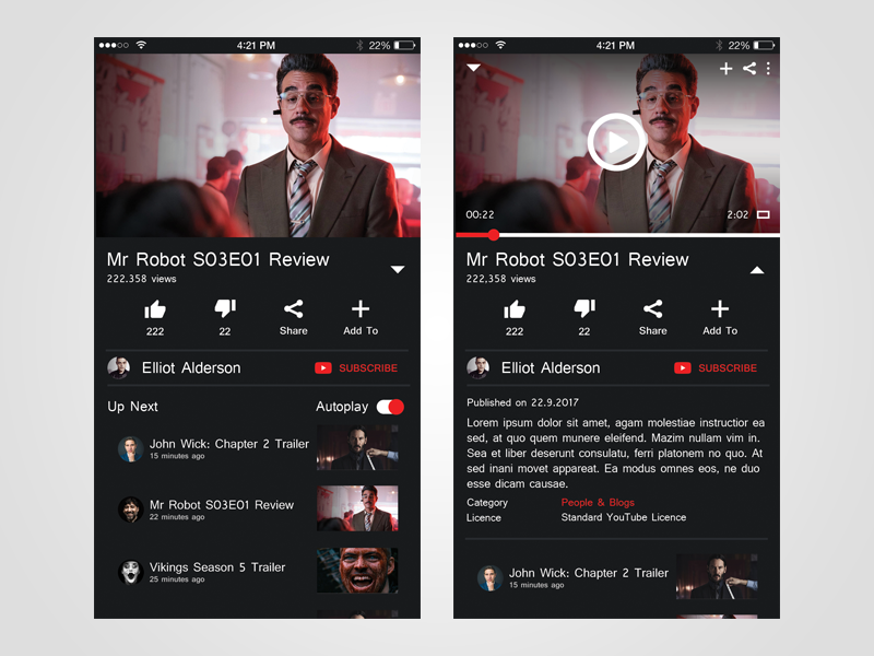
What attractive in design: Blank for button and text display, Night mode
To some degree, the Material Design language for the YouTube Desktop Web Edition also reflects the preference for mobile devices. So that’s reasonable to adopt the responsive design. So there is no doubt that the blank for buttons and text display is to adapt to the user habit on small-screen touch mobile devices.
The new night mode also shows its surrender to mobile devices. The interface of the desktop version is the white background. For the mobile device, it’s better to use the screen yellow in night-light mode, rather than the black and white background. All light removed, small screen, so the best method is to reduce the brightness to comfort users’ eyes.
2. Apple
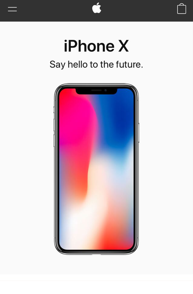
What attractive in design: Convenient scroll navigation
A user experience survey published by the Nielson/Norman Group shows that hiding navigation (like hamburger navigation) reduces content discoverability by 21% and increases navigation by 2 seconds on average. The Apple mobile website has a very good content layout. So users do not need to use the navigation button but scroll down the page to access information, very easy and convenient. The shopping bag icon is usually necessary and clear for user’s first glance for shopping. Furthermore, if no information wanted after browsing the page, you can search the desired information in the bottom navigation.
3. Pitchfork
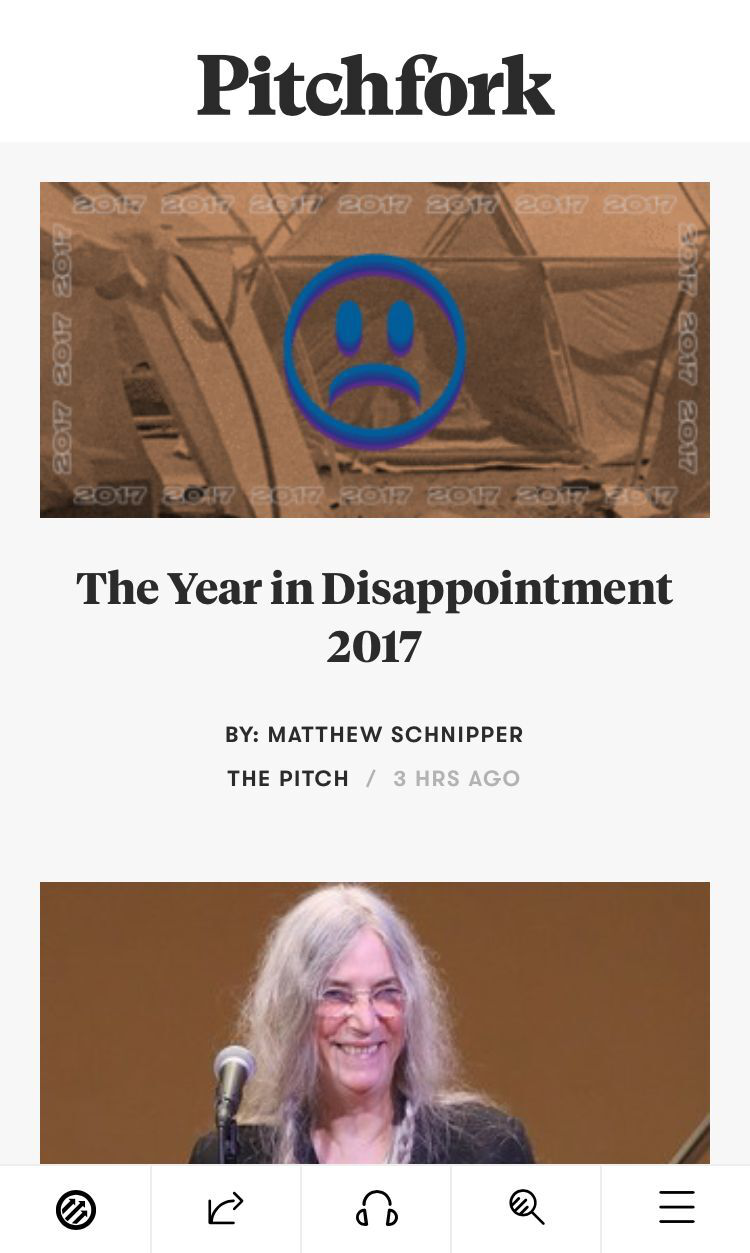 What attractive in design: Thumb design
Although there are many studies of thumbnail areas, many sites and applications out the navigation on the top of the screen. However, if you are careful enough, you will notice that the larger the phone is, the harder it is for the user to access the content on the outer edge of the screen. By contrast, Pitchfork puts the main navigation bar at the bottom of the screen, where the thumb touches most easily. With the growing number of mobile devices, this design type should be the future trend.
4. Typeform
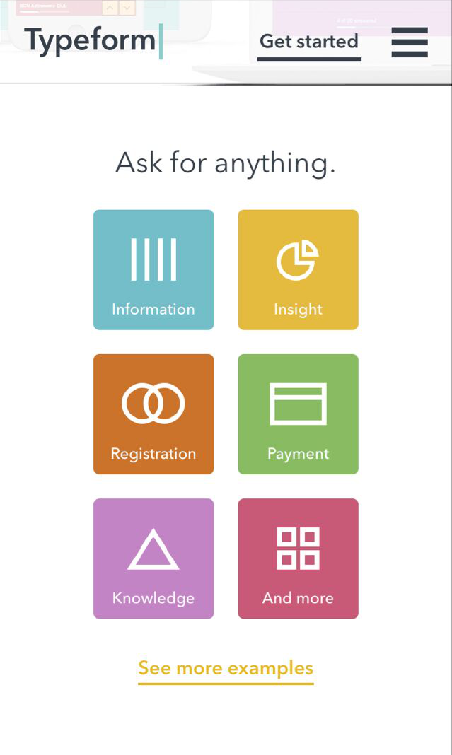
What attractive in design: Large Menu Button - Great for touchscreens
Typeform has a beautiful desktop design with a simple copy, high-definition video, animation and other design elements. But the complex design components are not user-friendly to mobile users, such as video and animation, which can significantly affect page load times. As a result, they cut down many unnecessary design elements on the mobile website page but retained the large menu buttons that work well on mobile devices, simplifying the overall mobile experience with simplicity and sophistication.
5. Airbnb
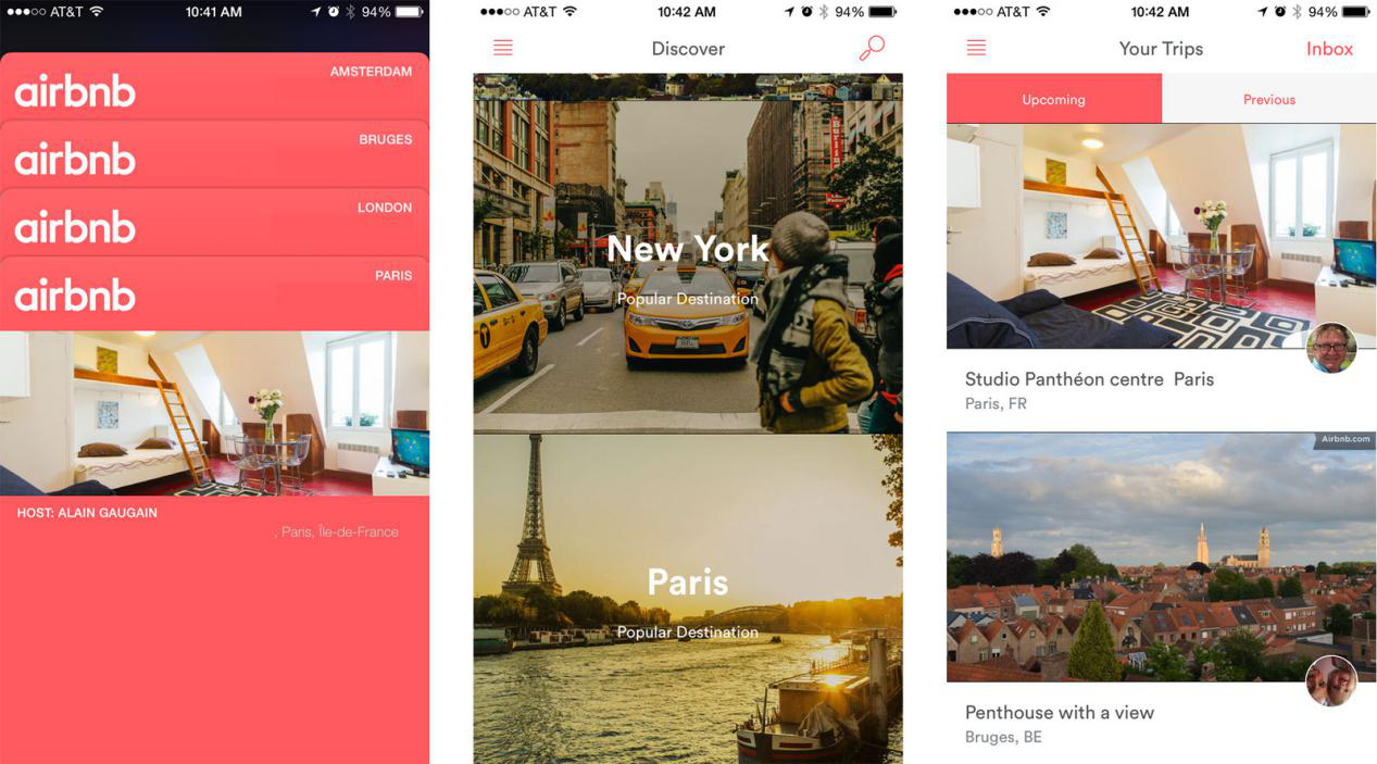
What attractive in design: Card Design
Card design makes it easier for users and information to connect with each other for a limited time. This is why Google chose card design as their design standard. Other Internet companies such as Airbnb have gradually accepted and adopted this approach. Each card's message is concise and effective and usually consists of a title, picture, graphic, or profile text. This design gives users enough information and makes it easy for them to decide if they want to go deeper and learn more.
6. Smashing Magazine
 What attractive in design: Emphasis on users, rational use of screen space optimization
Data show that more and more Internet users choose to stop the content they do not want, especially mobile users in recent years. Constant navigation settings, full-screen advertising, excessive marketing terms, and these do not give users a good user experience. If you want to push user ads or lead users to continue reading, you can push selectively based on what users are viewing. That’s why the strategic layout of the content is easier for users to click. If you simply break the user experience or get them to jump pages in order to get profit, you will lose users gradually, and the profit will decrease as users lose.
7. Facebook
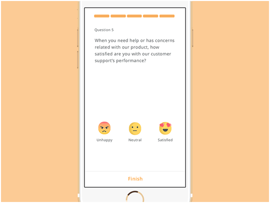
What attractive in design: Effective animation
The animations on the web pages help users to understand the current image vividly and give the user experience more expressiveness and humanity than to entertain the public. For example, MailChimp uses the Hi-five animation as a greeting after a successful mailing-out, a mini-animation of Twitter's forwarding or liking of functions, and a vivid expression package like Facebook. But if you want to animate on the page, please make sure it is elegant and decent.
8. Evernote
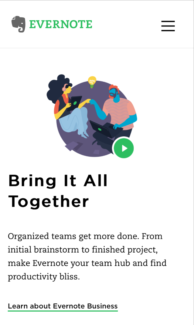
What attractive in design: Clean and fresh mobile UI interface
Evernote mainly provides note storage services which allow users to access information on all platform devices. So Evernote must get the right mobile user experience. Like the desktop version of the web design, Evernote's mobile website design keeps the same UI design clean and fresh. In addition, the right CTA button on the web is very useful to the user.
"Web design first, and then transplant to mobile design," this conventional model is no longer applicable today. Mobility is bound to be the design and development trend for the Internet industry in the future. Therefore, mobile first website design will become a new trend, even if this concept has existed for several years.
Why is the principle of mobile first design so important?
1. According to the Global Internet Report, up to 2016, the number of smart-phone users in worldwide has reached 2.8 billion.
2. Meanwhile, people spend more and more time on the mobile network every day.
3. As early as 2012, sales of smart-phones surpassed PC sales worldwide.
The explosive growth of mobile demand requires designers to pay more attention to the mobile version and follow the mobile design first principles in product design. So I believe that these reasons are enough for designers and merchants to study the mobile website design and benefit from it.
How to follow the mobile first design principles?
To create a mobile-friendly website that meets the mobile first design principles, a prototyping design tools such as Mockplus is needed.
Step 1: Log in your Mockplus account. If no, you can apply for a free Mockplus account.
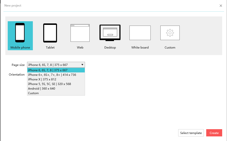
Step 2: Create a new mobile phone project;
Think about the layout
The mobile first design method is different from desktop first. In mobile devices, we need to think about effective information be displayed in small screen layouts. However, it does not simply reduce the information as page layouts change.
In this mobile first design example, we know some of the elements are required, such as the website's name and app logo should be concluded. However, not all desktop web design elements are suitable for mobile devices. So let’s set priorities based on the purpose of the travel website:
Start page, login page, welcome page, city list page, homepage, detail page, search page, activity page, personal information page and the like.
Final prototype design effect presentation
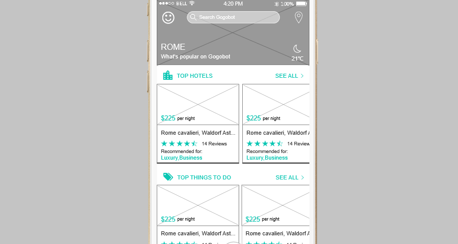
Cards design and rolling content display in line with mobile users access and operation of information by scrolling up and down the pages. No big picture seize the limited screen resources, and the scrolling of information is also willing to be accepted by the user. Because compared with the hamburger menu, users are more happy to scroll the pages.
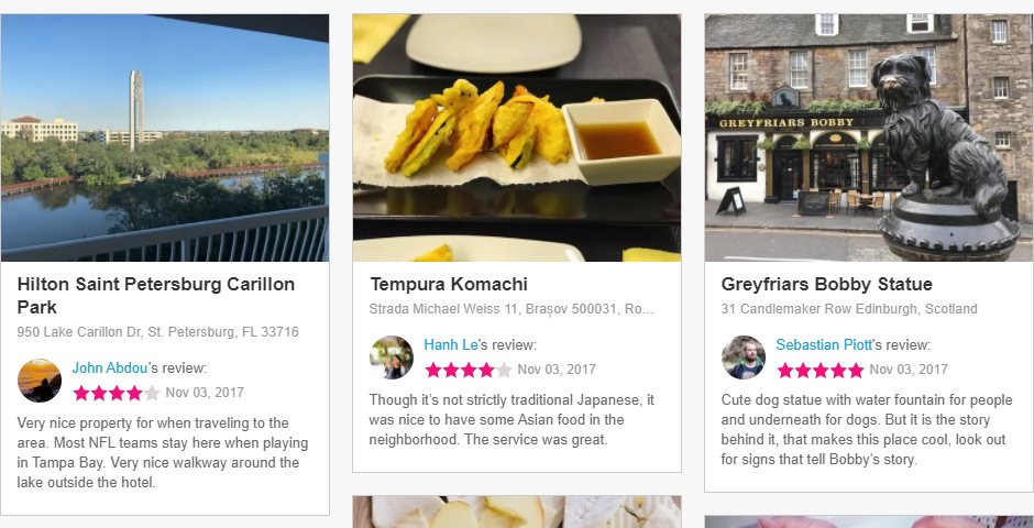
Desktop display: Gogobot
Conclusion
Through the revision of Youtube in this year, I believe that there will be more websites to pay attention to the mobile first design. Sincerely, I hope that the 8 mobile first design examples listed above can be inspirational for the construction of your new product or new website. In a short sentence, due to the limited traffic, the mobile website must be simple and rough, while the desktop website should be the best and be gorgeous. But not the mobile first almost becomes a right bullshit, as it becomes a common sense for almost all of Silicon Valley's mainstream businesses.
评论
发表评论