Basic UI/UX Design Concept Difference Between Wireframe, Prototype, and Mockup
The differences of wireframe, prototype, and mockup are always get confused by lots of designers, despite the experienced designer, I saw many people asked questions on Quora and Reddit about these terms, so it's essential to make clear about what the hell is it. That would solve a lot of problems and save energy for designers.
What is a Wireframe?
It's a graphic structure of a website or app containing the content and elements. Just like the blueprint of a building, to make it become a skyscraper needs many works and participants to be involved in. Likewise, the wireframe looks simple and needs furthermore works to be done by UX, UI, IxD designers. Briefly,Wireframe is a low fidelity layout design which has 3 simple but direct targets:
- Contains the main information
- Draw the outline of structure and layout
- Visual and description of the user interface
1. Visual features of wireframe
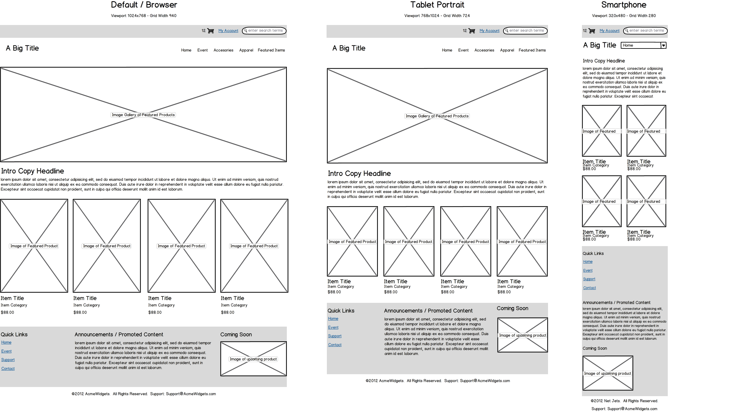
Visually, the wireframe exists some very obvious visual limitations, for it only needs simple lines, boxes, and gray color (different grayscale indicates the different level) to complete.
Wireframe exists very obvious visual limitations. In general, designers only need to use lines, boxes, and gray color (different grayscale indicates the different level) to complete.
2. Simple vector wireframe
The content of a simple wireframe should include pictures, video, and text etc. Thus, the omitted will be replaced by a placeholder, picture be instead by a shaded, and text will be replaced by some symbolic words according to the text layout.
3. Advantage of wireframe
The building of wireframe is fast and cheap.
Especially if you use some wireframing tools such aspaper and pen, Balsamiq. Of course, you should use these design tools to do it at the very beginning.
Compared with a complete and detailed high fidelity wireframe, gathering feedback via the lo-fi wireframe is much easier andmore important. Why? Because people pay more attention to software functionality, information architecture, user experience, user interaction flowchart, and it’s usability, rather than considering the aesthetic characteristics of these elements. Meanwhile, in this case, you can easily modify it according to demand, but not need to adjust coding and graphic editing.
4. Interactive wireframe
Sometimes, designers prefer to improve the fidelity of wireframes to enhance the importance of user interface at some aspects and display the rationality of interaction between fast test and the visual elements. Program to address these problems properly is using interactive wireframe, also known as the clickable wireframe.
If you want to create such a complicated wireframe, then you need UXPin, which is a tool for wireframing and prototyping design. Interactive prototyping may be the best presentation to developing team and clients. When you came across the problem that “what it will happen when I clicking this button?’’, you just need to click and show to your clients how it works on the interactive prototyping. Indeed, it’s quite impressive and direct.
5. Show wireframe cautiously
You must be cautious about the guy who is totally a layman when you need to present your wireframe to him. He may be your client, also may be a non-technical manager took part in the cooperation. But he does not know the truth that the wireframe and the final product may seem unrelated. So, he may not understand the intrinsic link and operation mode between them. Thus, you need to figure out a proper decision whether you need to present and how.
Wireframing design tools
Paper & Pen
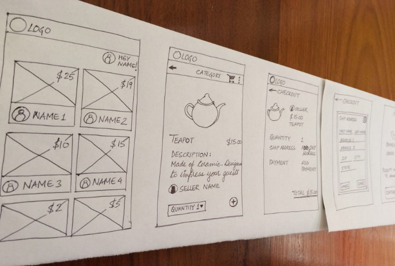
An easiest picked wireframing design tool is paper and pen. Draw casually on a paper with a pen, that's the simplest wireframe with basic lines and boxes. With it, designers would present the ideas intuitively with detailed text expression or oral speaking to clients and leaders. But this would not be used in the formal project for big companies.
Balsamiq
Sometimes, designers prefer to improve the fidelity of wireframes to enhance the importance of user interface at some aspects and display the rationality of interaction between fast test and the visual elements. Balsamiq provides a set of elements for static wireframing on two styles. Its hand drawing style would help to focus on the layout, function design, all colors are white and black. So you won't hear the complaint about the color settings and the visual effect.
What is a Prototype?
The requirement of a prototype is higher than wireframe. The difference is that prototype must be a high fidelity prototype which is interactive and fit the final user interface as much as possible. Meanwhile, it provides a complete user experience for the testers by simulating the real product interface and functional interaction.
1. Advantage of prototype
"A team-friendly prototyping is more conducive to communication between designers and developers. "
Why it’s so important? Because prototype is usually used for users to test product. Prototype test at the very early stage can save a lot of developing cost and time. So that it won’t waste the effort of back-end product architecture due to the unreasonable interactive interface. So, prototype is a perfect progress to test product for designers and developers.
Besides, providing prototypes with users to collect feedback, that’s benefit to have an insight into all the details of your product, and inspire the whole team. Many of the prototyping tools can build prototypes quickly and efficiently, but no coding needed.
The target of prototypes is quite obvious: to simulate the interaction between the user and interface as realistically as possible. When a button is pressed, the corresponding operation must be carried out, and the corresponding pages must appear, try the best to simulate a full product experience. When you came across the problem that “what it will happen when I clicking this button?’’, you just need to click and show to your clients how it works on the interactive prototyping. Indeed, it’s quite impressive and direct.
2. Visual features of prototype
Undoubtedly, the prototype must include the aesthetic features of a product that should have, and try to fit the final version. Basically, it’s a skin of a product, no HTML/CSS/JS involved, and not necessary to consider the server and database.
3. Prototyping test
Prototype testing is a key step in the prototyping design process which is one of the major milestones in the overall process. But how to conduct usability testing is a huge topic to talk here. A simple test may cost about an hour or so, it's enough to test 5 or 6 key scenes. Here are some FAQ listed for your reference:
- How does the user start the task? (Searching or browsing?)
- What does the user do first? and next?
- How does he make the final decision?
- Do they understand the design intent? Any difficulties?
It's a continuous process to make product prototype design, and it requires keep iteration and improvement.
Prototyping tools
Looking for a great rapid prototyping tool? No budget? No excuse. Mockplus Black Friday 2017 is here for you! Join Mockplus Official Slack group now, the admin will offer you 40% off coupons and free UI Kits & Fonts Package. This time-limited offer is valid for all packages and runs until 31st November, saving at least 80 bucks off the regular price. Besides, you will get life-time free tech support on Mockplus even if you are not a paid user now. Come and enjoy Mockplus Black Friday 2017!
Mockplus
Mockplus is the all inclusive prototyping tool for fast interaction, fast design, and fast previewing. It allows to create mockups for mobile (Android & iOS), Desktop (PC & Mac) and web apps. In the Mockplus 3.2, it added UI Flow Design Mode, Repeater, Demo Projects and Templates and Sketch Import. Other features like Mind Map Design Mode will be presented in the versions after Mockplus 3.2.
UXPin
UXPin has built more than 900 kinds of different UI elements for you to create wireframes and prototypes. Its responsive breakpoint function allows users to create responsive prototypes and wireframes that can run on different devices and resolutions.
What is a Mockup?
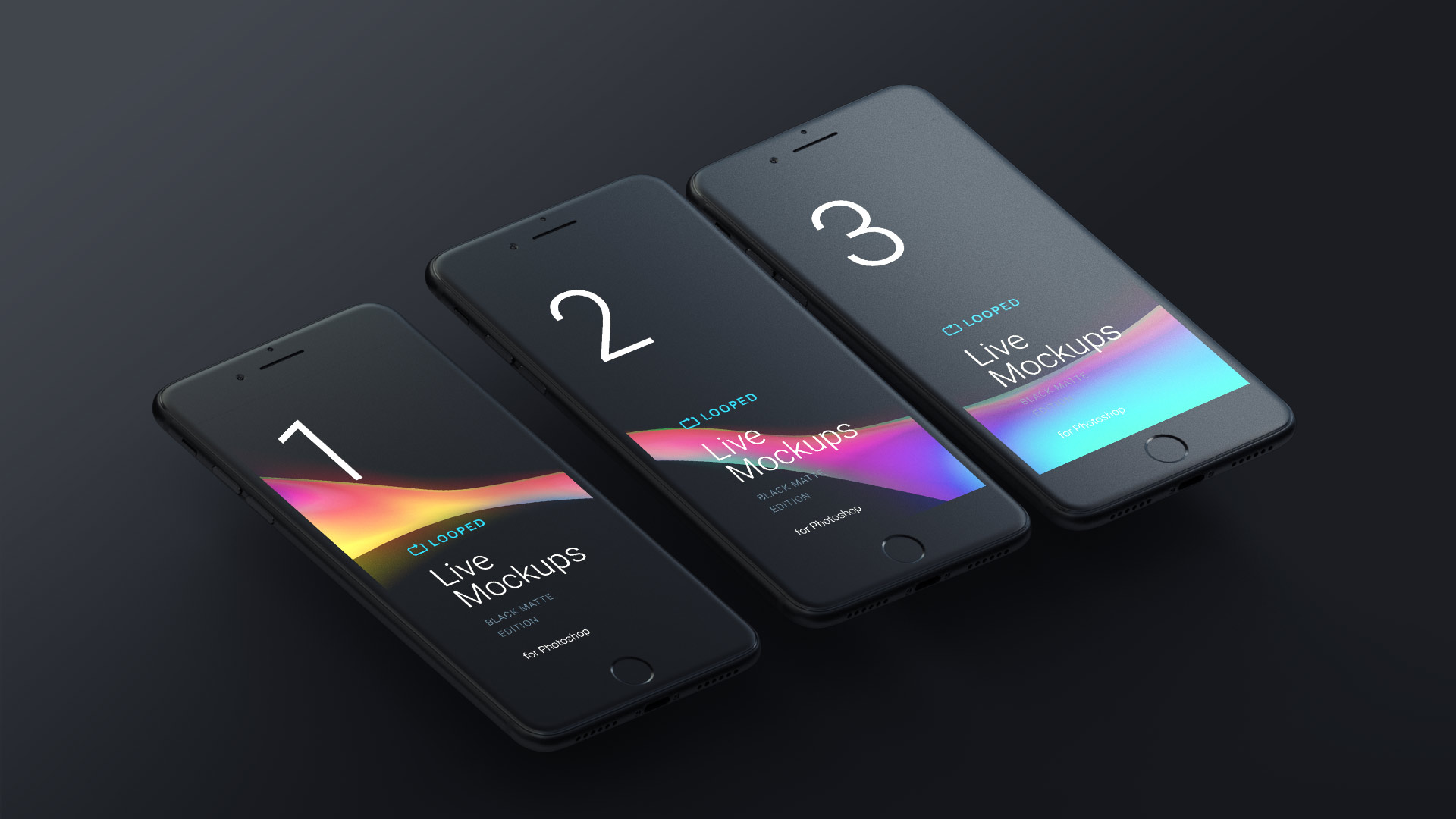
Mockup is the "visual script" used for the presentation of the overall visual design of the product. It has a richer visual elements than wireframe, including graphics, layout, color, and other more detailed visual presentation. To some degree, it's the final design of the product.
Like the wireframe, the Mockup is static and inoperable. It focuses on the appearance of the product through adding a wealth of visual elements to reach in high fidelity. That often used in visual design discussions for quick feedback and improvement on product visual design.
Design flow
After you have insight into the essence of design and known the difference between wireframe, mockup, prototype, you are standing in front of the user experience design world.
If you can concrete the series of product design into a cohesive and effective work flow, amazing thins will happen.
Tips
- Try to use editable and reusable elements when make wireframe. In that case, you just continue to refine the elements to complete prototypes based on wireframes.
- When you make wireframes, try to gather thoughts and opinions from your team and clients, and try to reflected them on wireframe designs.
- Use your most handy tool
评论
发表评论