20 Best Flat Mobile UI Design On Dribbble And Behance For Inspiration
Too much of flashy illustrations and animations in the past, and there is a new trend rose up, which is featured right opposite to the skeuomorphic design with drop-shadows, real object characteristics and faux-realistic textures. Flat design has a eye of a more simplified, classically digital aesthetic. Today, I’ll introduce 20 best flat mobile UI design examples, which are mainly from the hands of masters on Dribbble or Behance.
The following are the examples of good flat mobile UI design, enjoy and learn!
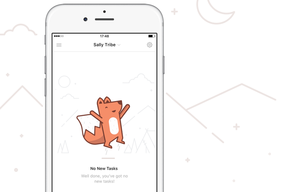
1) WeDo
Designer: Fabio Basile for Mikleo
Tools: Sketch, PS
Why we like it:I really like this beautiful little fox with bright color and geometric graphic elements. Pure color background interspersed with simple lines and graphs, very clean UI interface.
What is it: a little preview of a collaboration with the cool folks at WeDo, which can go register for early access. Spencer has kindly created a code for the players here. You can check the attachment to see some of the unused iterations.
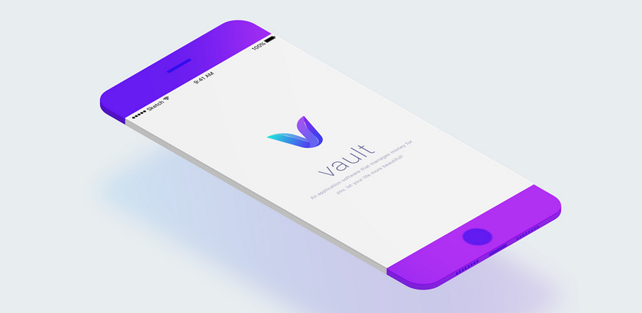
2) Vault financial app design
Designer: Higher
Tools: Sketch, PS, AI
Why we like it: The logo "V" is very impressive, highlight the Vault Financial app design.
Color scheme is pretty clean and simple.
Good typography in mobile UI, the hierarchy emphasized the key cope elements also create contrast.
What is it: Financial app project design. An application software that manages money for you, let your life more beautiful.
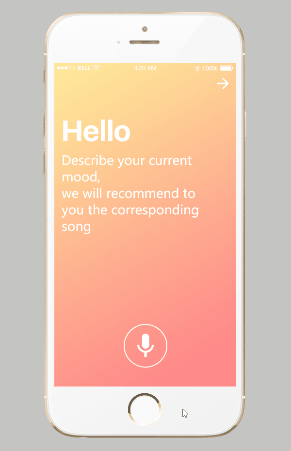
3) Intimate
Designer: Mockplus
Tools: Mockplus, PS
Why we like it: Color is bright, white space leaves plenty room.
Excellent interactive design.
The whole user interface is clean and good-looking.
What is it: Intimate is a lightweight APP. It aims at creating professional, personalized experience for the young by removing the complex features. When you open the APP, it will kindly ask your current state to automatically filter the music in line with the current mood. This prototype is made by Mockplus users, containing Home, Player, More.
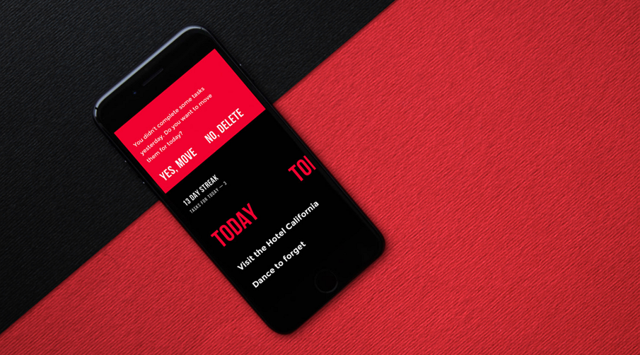
4) Upper APP
Designer: Ernest Asanov, Andrey Drobovich, Vlad Taran and Sergey Valiukh
Tools: PS, AE, Sketch APP
Why we like it: Color contrast is excellent. Black, red and yellow are in golden ratio in color proportion - 6:3:1 rule.
Simple and easy-to-understand interface.
Simple and elegant to-do list motivating users and boosting productivity
What is it: An official launch of mobile application for iPhones, Meet Upper. It's totally free for all the users. The details on user interface design for the app: the main objective behind it was to create a stylish and efficient to-do list without any distractions, concentrating user's attention on their goals.
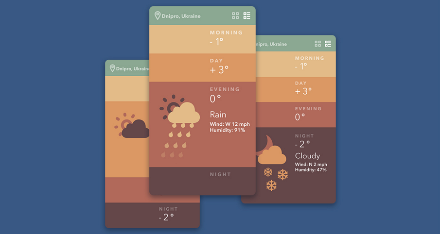
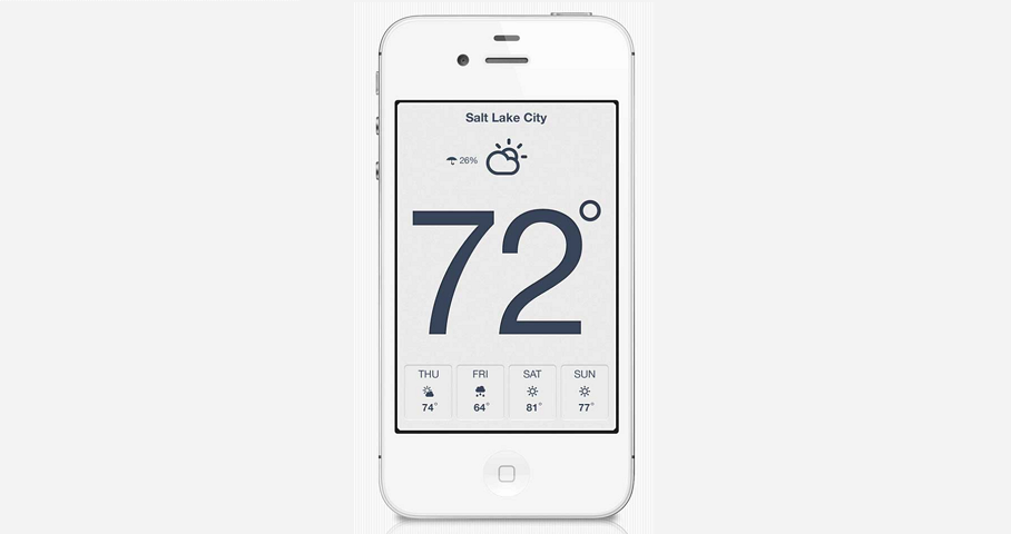
5) Weather App
By Sergey Valiukh & Tubik Studio
Tools: PS, AI, AE
Why we like it: Single screen-app, simple and clean.
Color gradient, a feature of flat deign, better than color transition.
What is it: A weather app concept animation. Sergey Valiukh & Tubik Studio created the concepts just for fun. But this could be realised in real life. The main idea is very simple — single screen-app that show currently weather in your region by four filters: morning, day, evening and night. All interaction are happening by changing of simple laconic shapes and harmonious colors.
6) Sea Schedule App
Designer: Valentyn Khenkin, Sergey Valiukh, Tubik Studio
Tools: PS, AI, AE
Why we like it: Blue is the NO.1 color that women and men both like.
Color variations between the background and the elements.
What is it: A creative concept in the domain of user interface design. This time it is a vacation-themed application allowing users to schedule their activities and effectively organize their time during a holiday. The presentation features two versions of the app: basic mobile application with UI Kit and its iPad adaptation. The basic idea was to make the interface stylish, user-centered and easy to use.
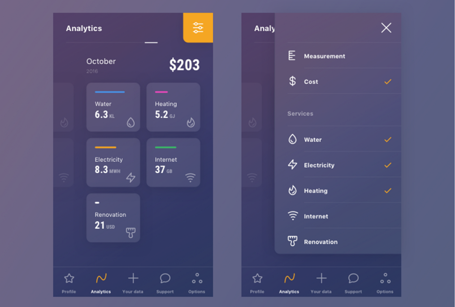
7) Analytics
Designer: Alexandr Oleynikov
Tools: PS, AI, AE
Why we like it: Pure purple background, in fashion and bold.
Icons are simple and easy-to -understand.
What is it: It's a new vision of an app which allows users to analyze monthly utility consumption.
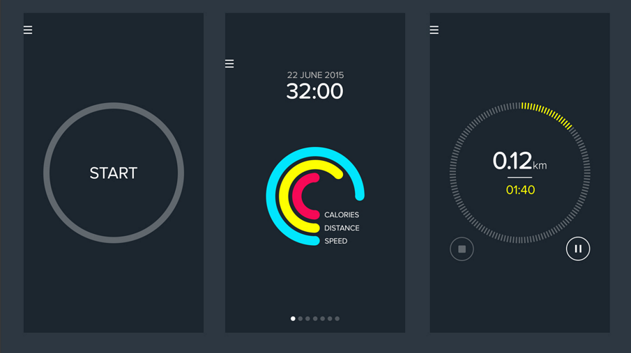
8) Lines activity tracker
Designer: Jakub Antalík
Tools: AI, AE, Sketch
Why we like it: Simple icons and clean lines.
Highlighted key information.
What is it: More of a human activity tracker, which will help you more healthy and happy.
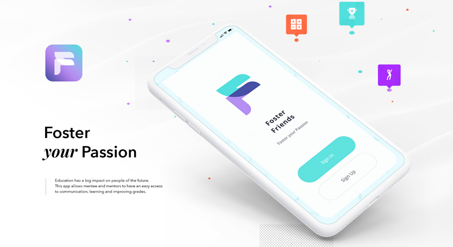
9) Foster Friends
Designer: George Railean
Tools: PS, AE, Sketch App
Why we like it: I really like the logo "F", it's quite creative, got the feeling of "Foster my passion"
pure background, the interface is clean.
What is it: Mobile app for iOS UI and Android. UX performance for a new type of user flow. This app was created for middle and high school students that wants to perform their study achievements.
10) Accurun - An iOS running tracker app
Designer: Grégoire Vella
Tools: PS, AI, AE
Why we like it: Round shape icons with bright colors, simple but appealing.
Pure black background, creating a UI interface that looking elegant.
What is it: Grégoire Vella runs almost everyday and uses mainstream tracking apps. However none of them are minimal enough for he. It’s why he wanted a simple, beautiful and reliable app, which stays focus on tracking. No big deal.
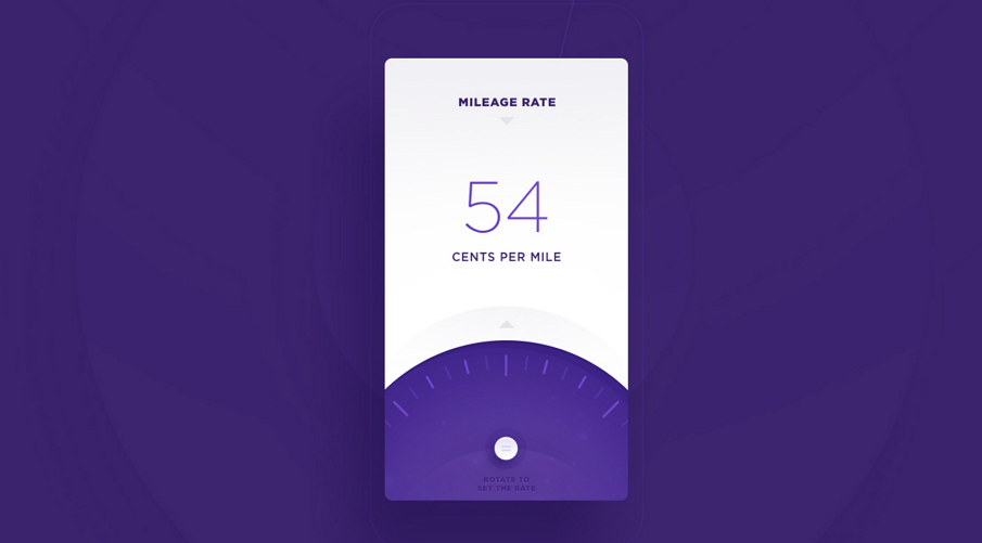
11) Mileage Tracker - Website & Application Design
Designer: Stanislav Hristov, DTAIL STUDIO
Tools: Wacom Cintiq, PS, AI
Why we like it: Beautiful color contrast between purple and white.
Very simple but well-informed interface.
What is it: It's a Mileage Tracker Website & Application Design, with simple UI elements but powerful information. Easy to understand and use.
12) UI Development
Designer: Ramotion
Tools: Adobe Illustrator Draw, PS, Xcode, Apple XCode, Sketch, Android Studio Swift
Why we like it: Very clean interface and the excellent interactive.
What is it: Open source iOS and Android controls created by skilled developers in pair with passionate designers for everyone to use in their apps.
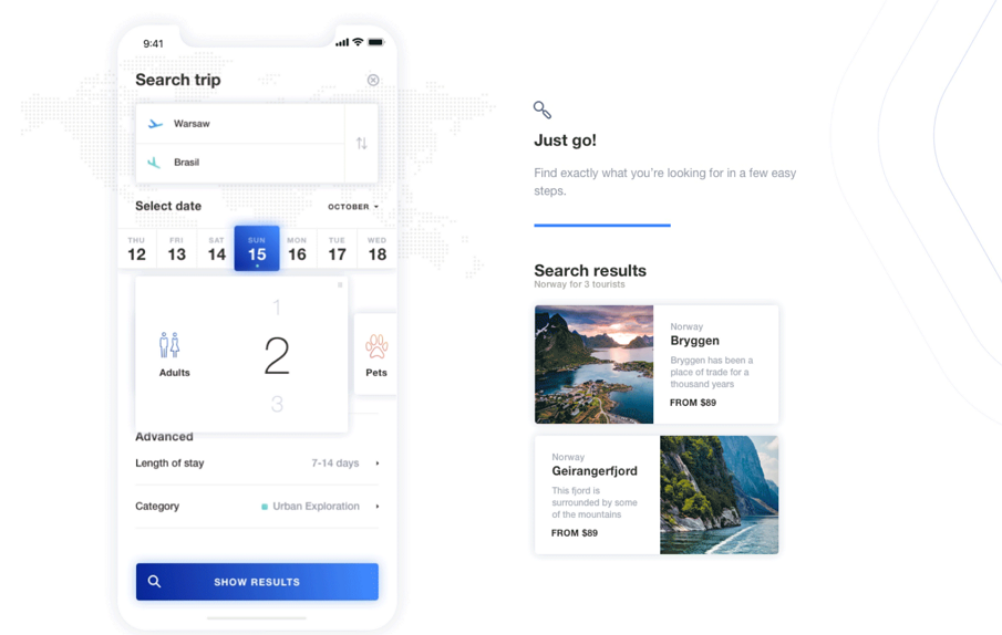
13) Travello App Concept - Plan a new travel adventure
Designer: Karol Cichoń, Adam Kalinowski, inFullMobile Team, Tobiasz Usewicz
Tools: AE, Sketch APP
Why we like it: Good interactive, easy to use and understand.
Pure white background, clean and simple.
What is it: World can be yours with just a few swipes. Do you happen to plan a new travel adventure? This Travel App will help you to discover new places.
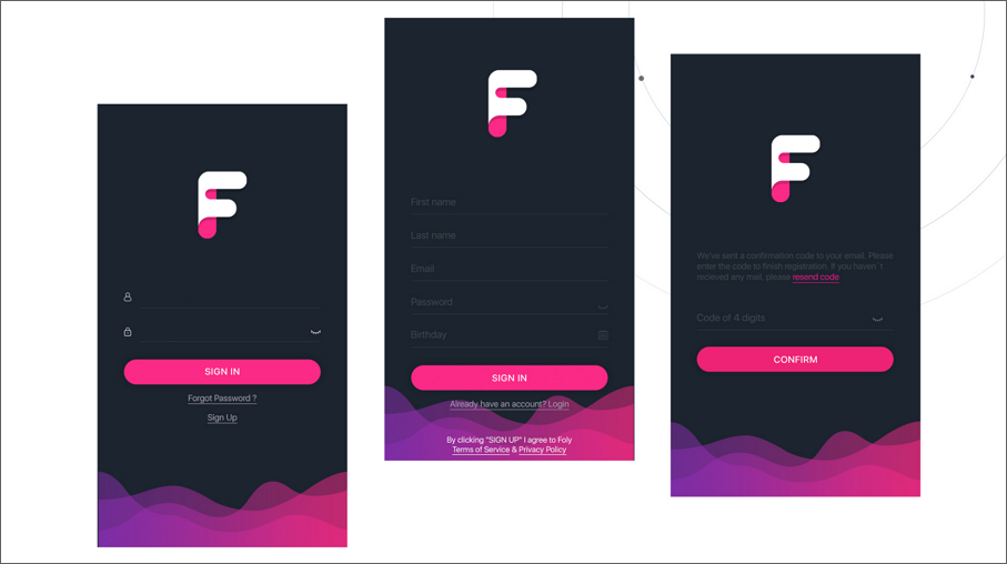
14) Foly Mobile App
Designer: Lilit Harutyunyan, Sergey Muradyan
Tools: Wacom Intuos, AI, PS
Why we like it: Beautiful color contrast, simple but powerful UI elements.
Pure black background.
What is it: Foly is an application connecting artists and creative people.
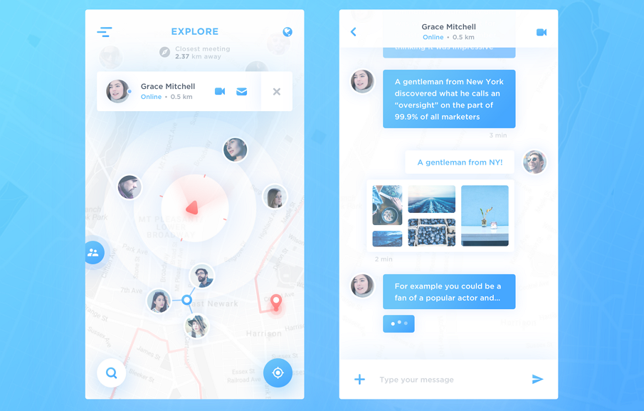
15) Map Chat App
Designer: Vadim Gromov
Tools: Sketch APP
Why we like it: Clean and good-looking color scheme with white and blue.
I like the icons.
What is it: Map Chat APP is a useful and creative application for communicating and chatting.
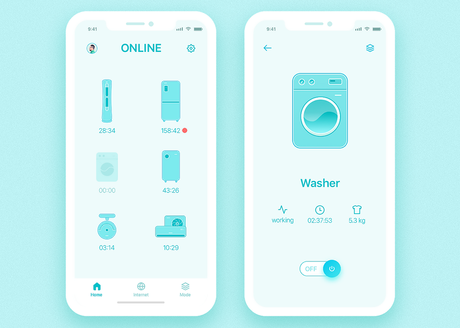
16) Smart Home App - iPhone X
Designer: Sunny UI
Tools: Ps, Sketch app
Why we like it: Light pure green background, comfortable and clean.
Vivid and solid icons.
What is it: Smart Home App - iPhone X. The arrival of iPhone-X was an important event in 2017, A few days ago Sunny UI designed a project about a smart family, and wanted to be able to design it on a new phone.
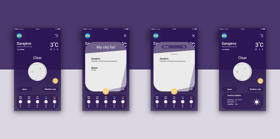
17) Weather app
Designer: Sein Baručija
Tool: PS
Why we like it: Dark purple is creative and bold. Color combinations is excellent.
I like the icons in round shape.
What is it: An App about weather, make your life more comfortable and nice. A good flat mobile UI design inspiration.
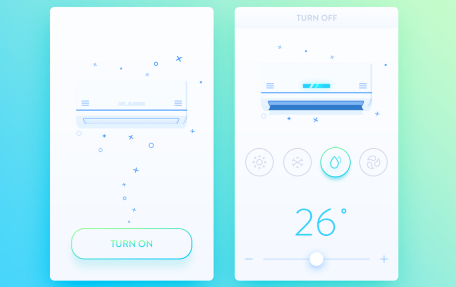
18) The air conditioning control interface
Designer: Jude TU
Tools: PS
Why we like it: Icons and graphics are simple and meaningful.
Pure white background.
What is it: The cell phone in hand, don't need the remote control, any corners can control air conditioning in the home, let the life more convenient.
19. Animation Set 2015 v1.0
Designer: Sergey Valiukh & Tubik Studio
Tools: PS, AI, AE, Mac OS X, Axure, Sketch 3.0, Google Chrome, InVision, Marvel
Why we like it: Excellent interactive and animation.
All interface consisted of highly contrasted color lumps.
Beautiful icons.
What is it: Here is a small presentation of a four-month work. Tubik Studio wants to share with you some new concepts and mobile interface animations. An amazing app for adding posts to profile feed, meeting new people and clicking in at great venues.
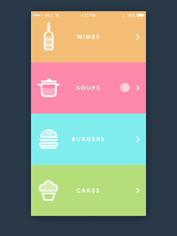
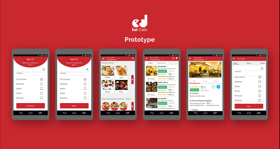
20) Eat Daily PROTOTYPE with Mockplus
Designer: Akash Khandavilli
Tools: Mockplus, PS
What is it: Eat Daily app is a restaurant finder super easy and fast. Fast search in a traffic or busy schedule.Most of them say sign in problem when they open app. Most of the apps don't learn about food habits. Search takes more than 10 secs. Font size where elders can't see. Colour visibility in hot sun. Eye catching comparison of two restaurants in a list. Lot of food delivery issues.
What is in common in the above 20 flat mobile UI deisgn?
- Simplified, classically digital aesthetic
All the elements on the interface is of simplified, classically digital aesthetic. This is also the core of flat design. For example, use simple icons with clear meaning. Use sans-serif rather than fancy fonts.
Use solid and vivid colors to highlight the key information. But one thing you should keep in mind, that flat design don't always need to rely on bright and vivid colors. The following is a typical example:
More details towards How To Use Color In UI Design Wisely to Create A Perfect UI Interface.
1) Fonts
Use Sans-serif to create a clean interface as well as work with other elements towards a comfortable visual look.
2) Text
Adopt font size and color to create contrast for emphasizing the central information. Just don't go too far, the contrast should be moderate.
- Interactive design
User experience of flat design seek more than only to its simple and clean visual effects, also the clear and concise interactive design is of great importance. Good interaction design must avoid causing user confusion and get overwhelmed with interactive process.
- Tools
Based on the above 20 flat mobile UI design and my personal experience. I would like to recommend the most suitable tools:
1) Prototyping tool --- Mockplus
Mockplus comes with more than 3,000 icons and nearly 200 components. Just drag these components into the canvas for a combination to prototype your app ideas within few minutes. Focus on design itself and no more efforts will be spent on making a component. The interaction design in Mockplus is totally.
2) Vector tools --- Sketchch
Sketch is a professional vector graphics tool aimed at UIS design and Web. Sketch holds the features of vector editing and perfect pixel. Its smart guides can quickly and accurately dimension the line between two elements, which is great for design. Sketch has excellent output capabilities which support native multi-fold and multi-format output, what's more, it supports own suffix.
3) Image processing software --- Photoshop
PS is a powerful image processing software. But many new designers may take PS wrong as the graphic processing tools. Of course there are many design tools are not listed here. It's not about how many tools you use, it's all about how you master each tool.
Why flat design plays a big role in mobile UI design?
Mobile UI design should follow the trends of flat design, moreover, flat design can bring its superiority into full play on mobile UI design. That is, due to the limited screen, flat design is the best way to present necessary information and elements directly so as to reduce user cognitive disorder to a large content. Besides, as websites and Apps are falling into various screens with different sizes, it’s hard to do skeuomorphic design make them adopted to various platforms, in this case, flat design can easily make sure all designs looks pretty on any-sized screens.
Flat mobile UI design will gain more attention is inevitable in future. Just pay attention to it. Hope this article can bring you some inspiration.
More readings:


评论
发表评论